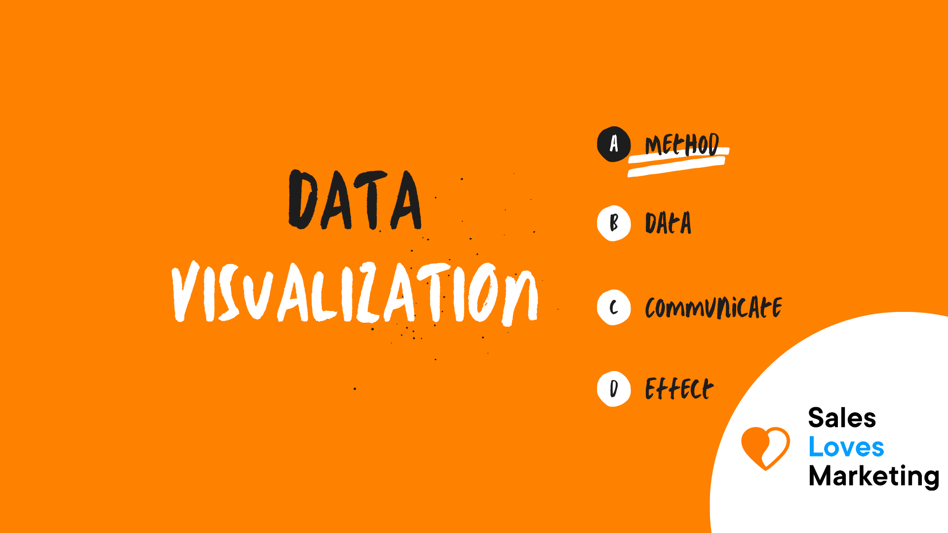
What is Data Visualization?
It is a method used to display information and data in graphical form.
Visualization tools such as videos, maps, charts, infographics, among others, can be used to help understand trends, patterns, and particular values in large data sets and draw conclusions.
Why is Data Visualization Important in Marketing?
Data visualization is important in almost every field because it provides a fast and effective way to communicate information universally.
In marketing, it is very useful because it can be applied in different cases:
- It helps to interpret patterns and analyze trends in customers, sales, market research, costs, forecasts, among others.
- A timely and organized view of the data contributes to increased productivity and sales of the company because it helps to make decisions quickly.
- Data Visualization offers the possibility of showing information creatively and strikingly for the company. As effective and timely communication in marketing is vital, good Data Visualization saves time and money and provides confidence and motivation to employees and executives.
- Like a marketing tool, it is very useful to create content for campaigns, showing consumers common problems and how a brand can help solve them.
- In digital marketing, a clear example of the importance of Data Visualization is the use of Google Analytics tool, with them is possible to view and analyze data from campaigns and social networks that become significant when planning and optimizing marketing strategies. Among the data that can be observed are: which pages of a website get more conversions, which social channels have more traffic and how it varies according to the time or specific time, where customers are geographically located, which pages have a high bounce rate, and what they have in common, among others.
How to visually process data for marketing?
Choose the method to visualize data
There are various ways to represent data visually, such as diagrams, infographics, charts but not all of them fit all needs or are the easiest way to do it. To choose, one must take into account the amount of data to be included.
If, for example, someone wants to compare data, it’s possible to use a pie chart to create more impact.
Another example is if time and location are important in the data that is going to be shown, using timelines and distribution maps or, if needed, to represent a large number of points in a certain range, it’s possible to do it with a scatter plot or a dot plot.
The important thing is to use the simplest and most effective method to convey the information in a timely and appropriate manner.
Develop and design the visual image or graphical representation
Visually representing the data in a way that looks attractive and easy to understand it’s paramount. For this task, there are a wide array of tools in the market depending on the kind of representation needed.
When creating graphs or charts, spreadsheet programs such as Google Sheets or Microsoft Excel can be used. If you want to make a more elaborate design there are good tools like Canva, a program with a unique amount of charts, graphs, templates for newsletters, or infographics that can be customized to adapt them to social networking accounts, websites, or email marketing campaigns.
Evaluate Data Visualization
When you have visualized data, you can already evaluate it to detect patterns or trends and define more effective marketing strategies.
How to Choose Data Visualization Tools?
To select a tool to visualize data, it is key to know what you need to get from it. Among the aspects to consider are:
- What is the visualization capacity they offer?
- If your data or sources are compatible with the tool or offers ways to manage and connect data.
- Whether the tool is easy to use and operate or requires some kind of skill to run smoothly.
- Finally, whether the tool has mobile compatibility so that users can access it from any mobile device and interact in various ways.
Among the best tools for data visualization are Klipfolio, Tableau, Infogram, Plecto, Datawrapper, Highcharts & Google Data Studio.